
~4 minute read
Tools:
Tools:

Project overview
Capricorn Digital is an internal web platform used by field technicians to record updates after completing their jobs.
Capricorn Digital is an internal web platform used by field technicians to record updates after completing their jobs.
Over the years, new categories, subcategories, and modules were added, but without a consistent logic. As a result, the system became complex, full of duplicated pages, conflicting terminology, long tables, and unpredictable UI patterns. Technicians often struggled to find the right place to log their work, and the navigation didn’t reflect the actual workflow technicians followed in the field.
Over the years, new categories, subcategories, and modules were added, but without a consistent logic. As a result, the system became complex, full of duplicated pages, conflicting terminology, long tables, and unpredictable UI patterns. Technicians often struggled to find the right place to log their work, and the navigation didn’t reflect the actual workflow technicians followed in the field.
My role
From May to July 2023 I worked closely with a senior designer and a team of developers, and my role included:
From May to July 2023 I worked closely with a senior designer and a team of developers, and my role included:

Researching the platform structure
Researching the platform structure

Identifying hidden logic issues
Identifying hidden logic issues

Redesigning the information architecture
Redesigning the information architecture

Creating the design system foundation
Creating the design system foundation

And delivering the wireframes and UI.
And delivering the wireframes and UI.
Research → UI
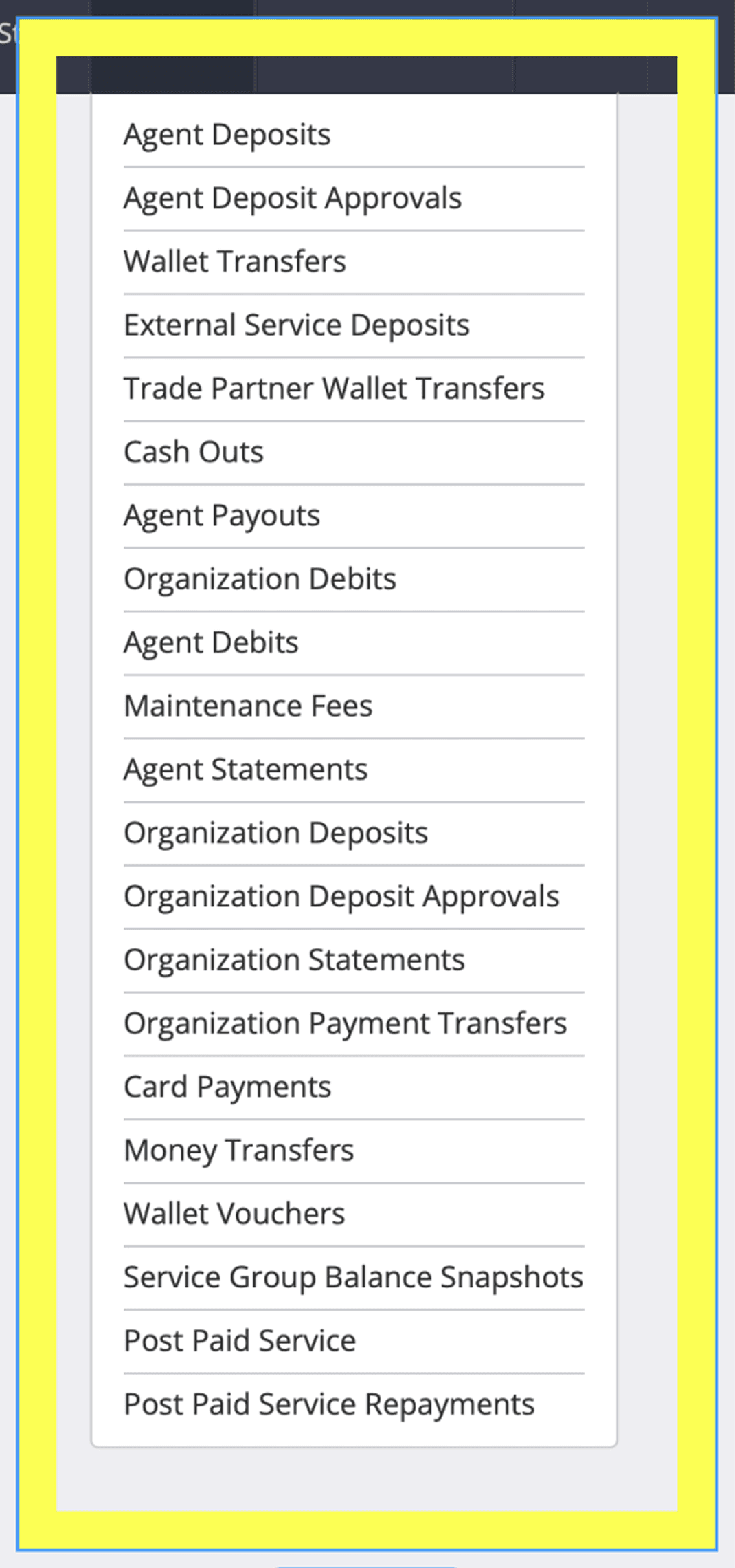
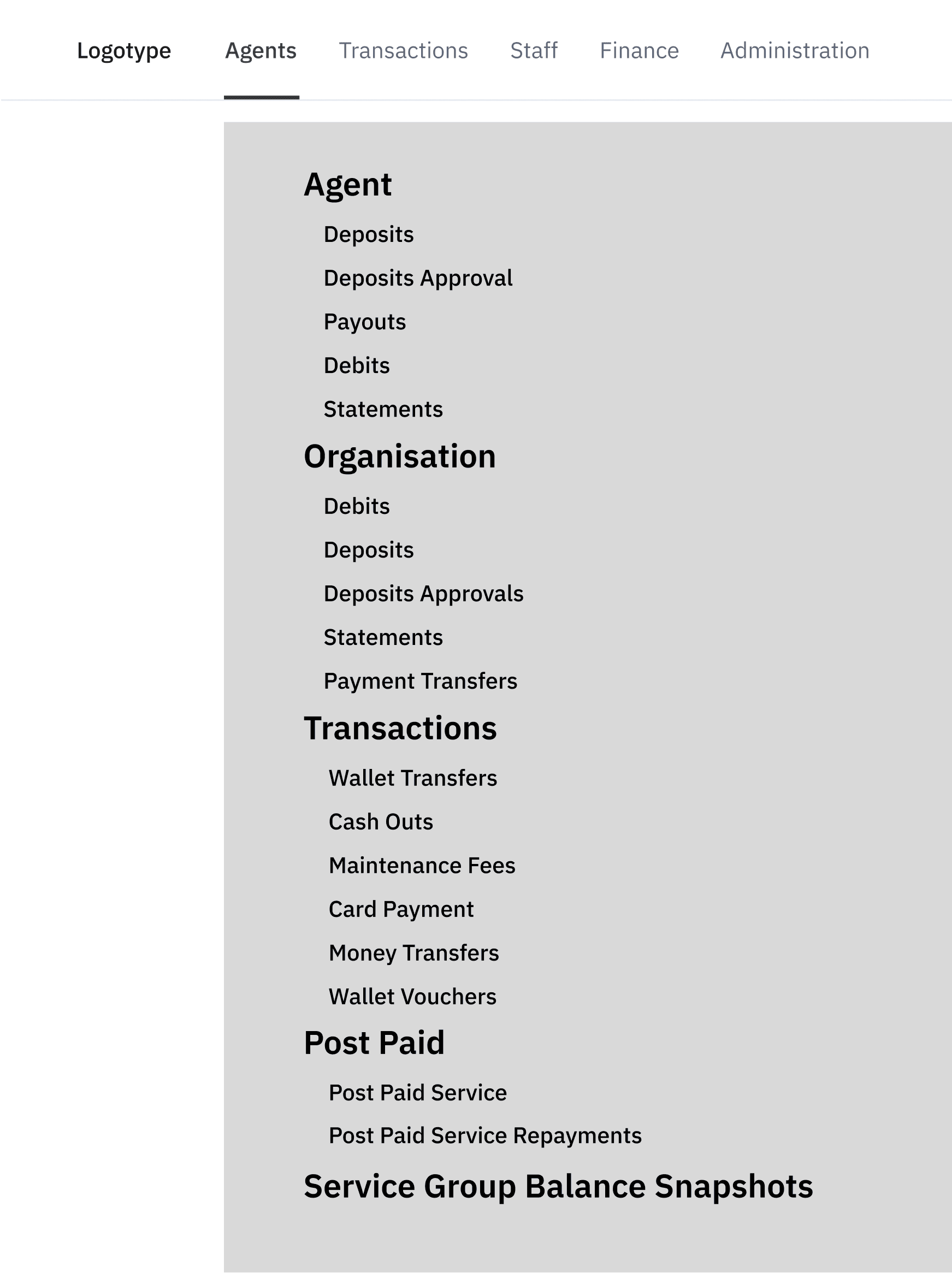
In my first days on the project, I began mapping all categories, subcategories, and the associated tables of the existing website.
In my first days on the project, I began mapping all categories, subcategories, and the associated tables of the existing website.
Hover over to try the magnifying glass
Press on the image for magnifying glass
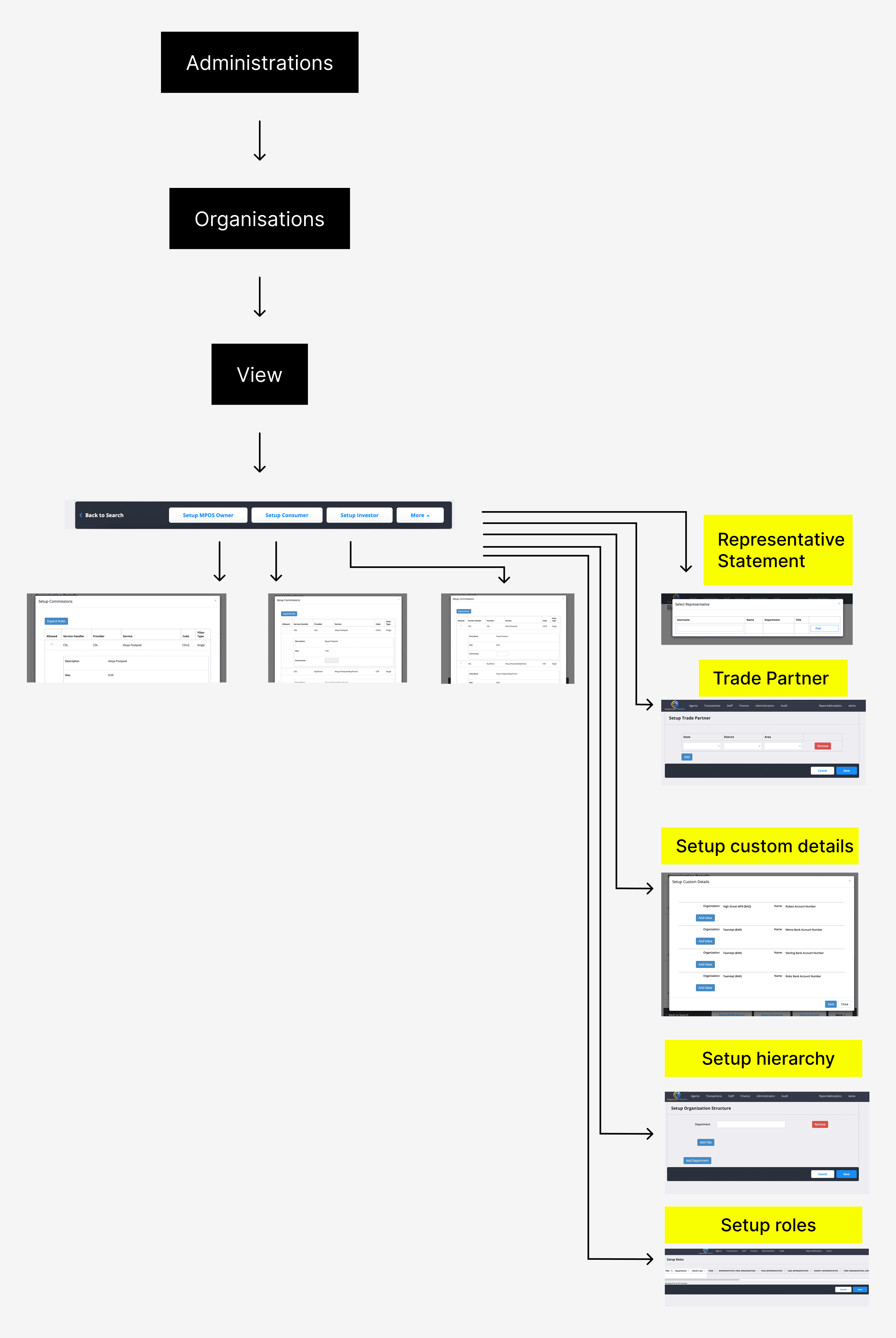
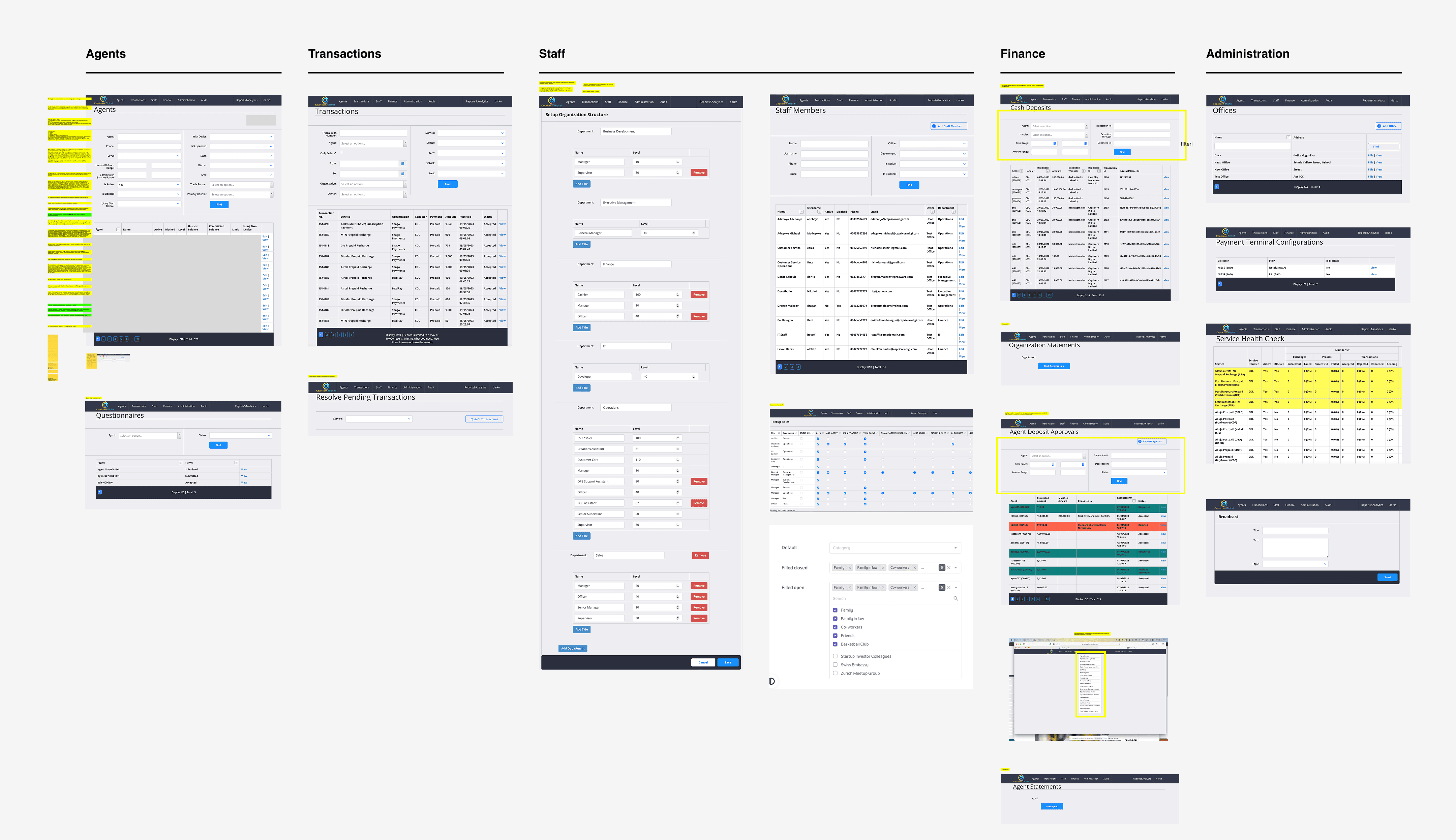
This is where the deeper problem began to surface: many categories had conflicting titles, some were duplicated across modules, and several long tables could logically be merged into one.
This is where the deeper problem began to surface: many categories had conflicting titles, some were duplicated across modules, and several long tables could logically be merged into one.
What we did with complex IA
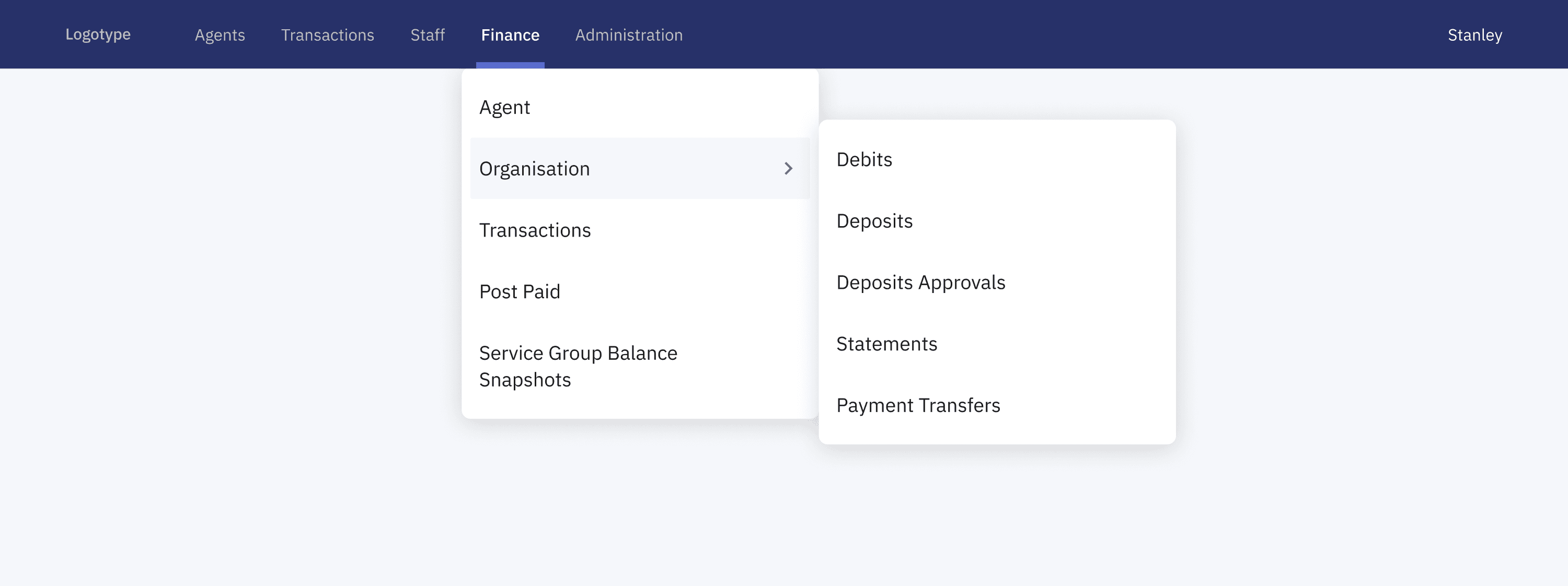
IA update
First we needed to update the IA - this made it easier for technicians to understand where things belonged, especially in areas that used to cause a lot of second-guessing. We couldn’t measure it formally, but the goal was clear: help people find the right place faster, make fewer mistakes, and need less guidance when using the platform for the first time.
Hover over to try the magnifying glass
Press on the image for magnifying glass
→
→
Reducing the cognitive load
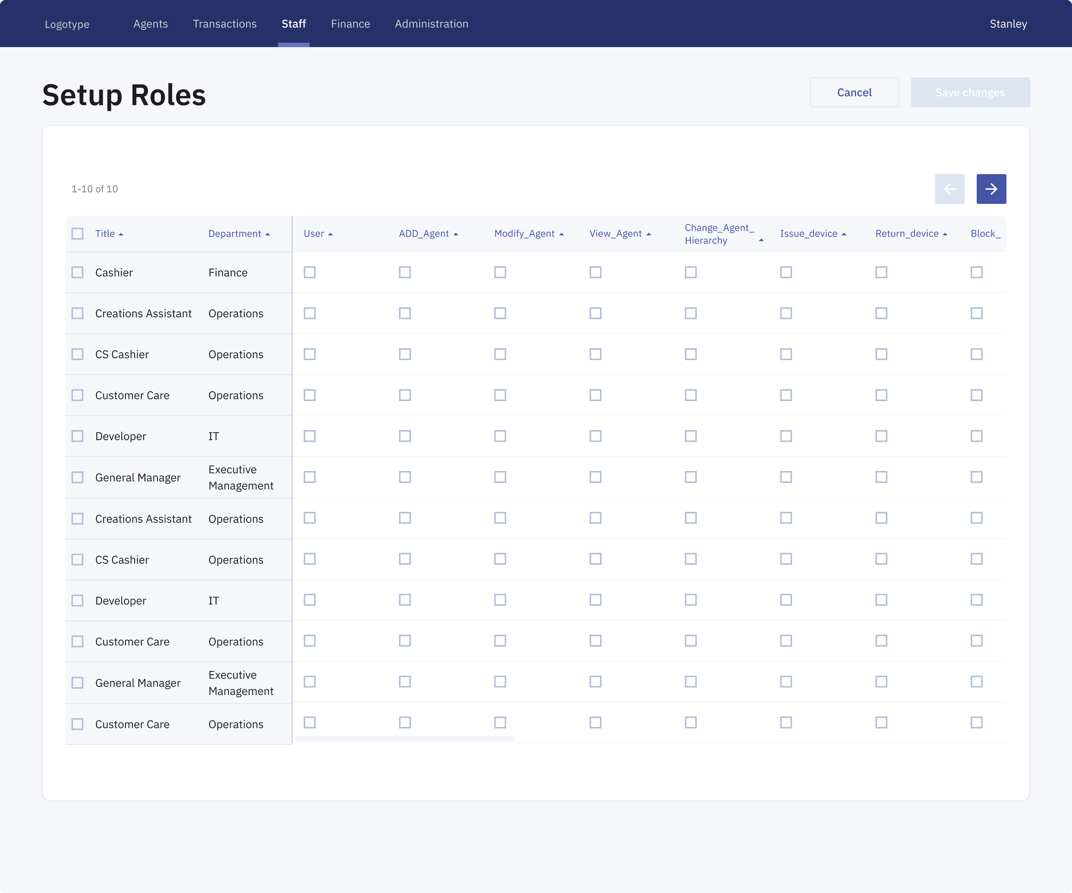
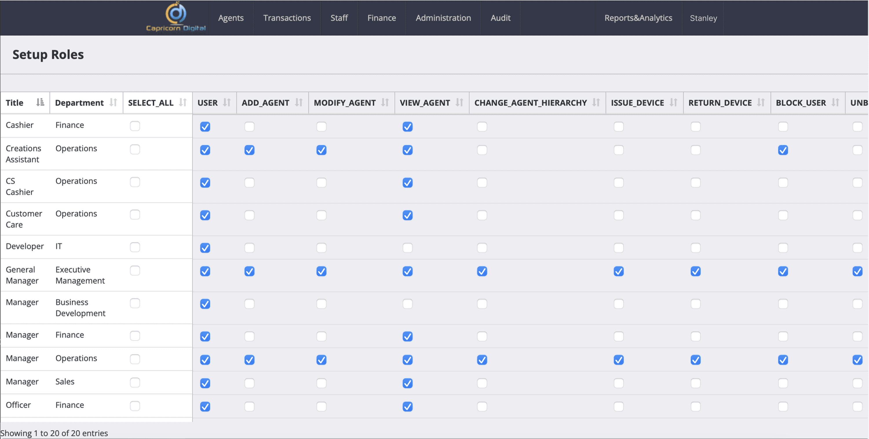
Next, screens like the Setup Roles view were restructured to reduce cognitive load and make permission editing more predictable. The original layout showed more than 20 roles on a single long page, repeated a “Select all” checkbox on every row, and offered no clear way to confirm changes.
Next, screens like the Setup Roles view were restructured to reduce cognitive load and make permission editing more predictable. The original layout showed more than 20 roles on a single long page, repeated a “Select all” checkbox on every row, and offered no clear way to confirm changes.
Hover over to try the magnifying glass
Press on the image for magnifying glass
→
The redesigned version breaks the table into manageable pages, introduces horizontal scrolling for wide permission sets, and moves “Select all” to a single, global control in the header. Persistent “Save changes” and “Cancel” actions were added so edits can be confidently applied or discarded.
The redesigned version breaks the table into manageable pages, introduces horizontal scrolling for wide permission sets, and moves “Select all” to a single, global control in the header. Persistent “Save changes” and “Cancel” actions were added so edits can be confidently applied or discarded.
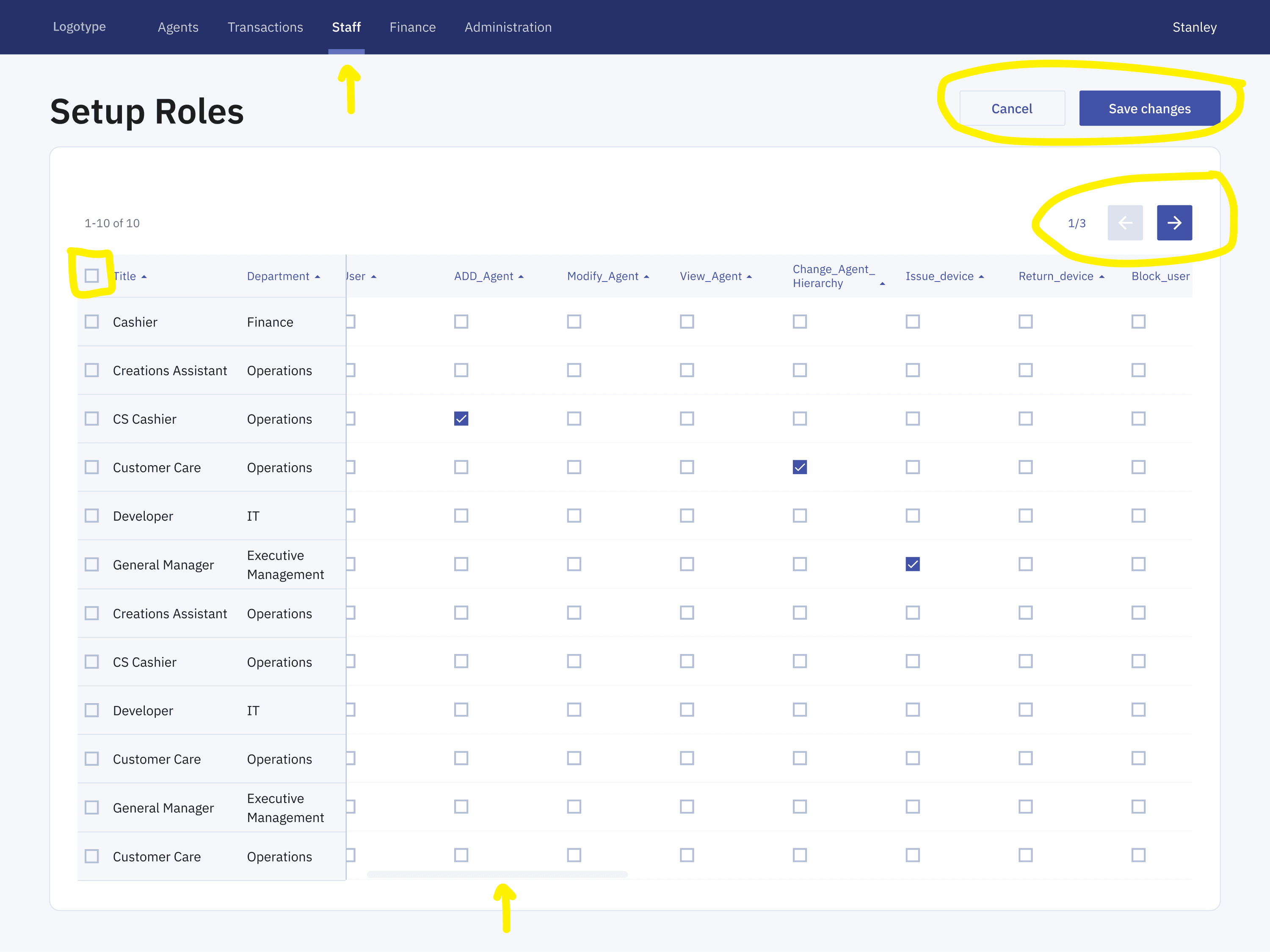
Result: Overall, the experience became cleaner, more structured, and significantly easier to navigate for administrators managing large permission sets.
Result: Overall, the experience became cleaner, more structured, and significantly easier to navigate for administrators managing large permission sets.
Result: Overall, the experience became cleaner, more structured, and significantly easier to navigate for administrators managing large permission sets.
e.g Transactions flow
The transactions workflow below shows how the experience evolved from a fragmented flow into a clearer, system-led journey. The redesign introduces a new information architecture and updated UI patterns that surface key data earlier and group actions more intentionally. Together, these changes make transactions easier to understand, review, and complete within the broader product ecosystem.
The transactions workflow below shows how the experience evolved from a fragmented flow into a clearer, system-led journey. The redesign introduces a new information architecture and updated UI patterns that surface key data earlier and group actions more intentionally. Together, these changes make transactions easier to understand, review, and complete within the broader product ecosystem.
Before:
A dense, form-heavy interface that made navigation and filtering feel overwhelming.
After:
A cleaner, structured layout that reduces cognitive load and supports focused workflows.
One system for multiple workflows
The references below informed the foundation of Capricorn Digital’s design system and helped define the overall direction before any individual screens were designed.
The references below informed the foundation of Capricorn Digital’s design system and helped define the overall direction before any individual screens were designed.
Each product handled complexity differently, specifically how dense, operational data was organized into layouts that are easy to scan and navigate.
Each product handled complexity differently, specifically how dense, operational data was organized into layouts that are easy to scan and navigate.
Result: This helped set a clear visual direction focused on hierarchy, consistency, and clarity.
Result: This helped set a clear visual direction focused on hierarchy, consistency, and clarity.
Result: This helped set a clear visual direction focused on hierarchy, consistency, and clarity.
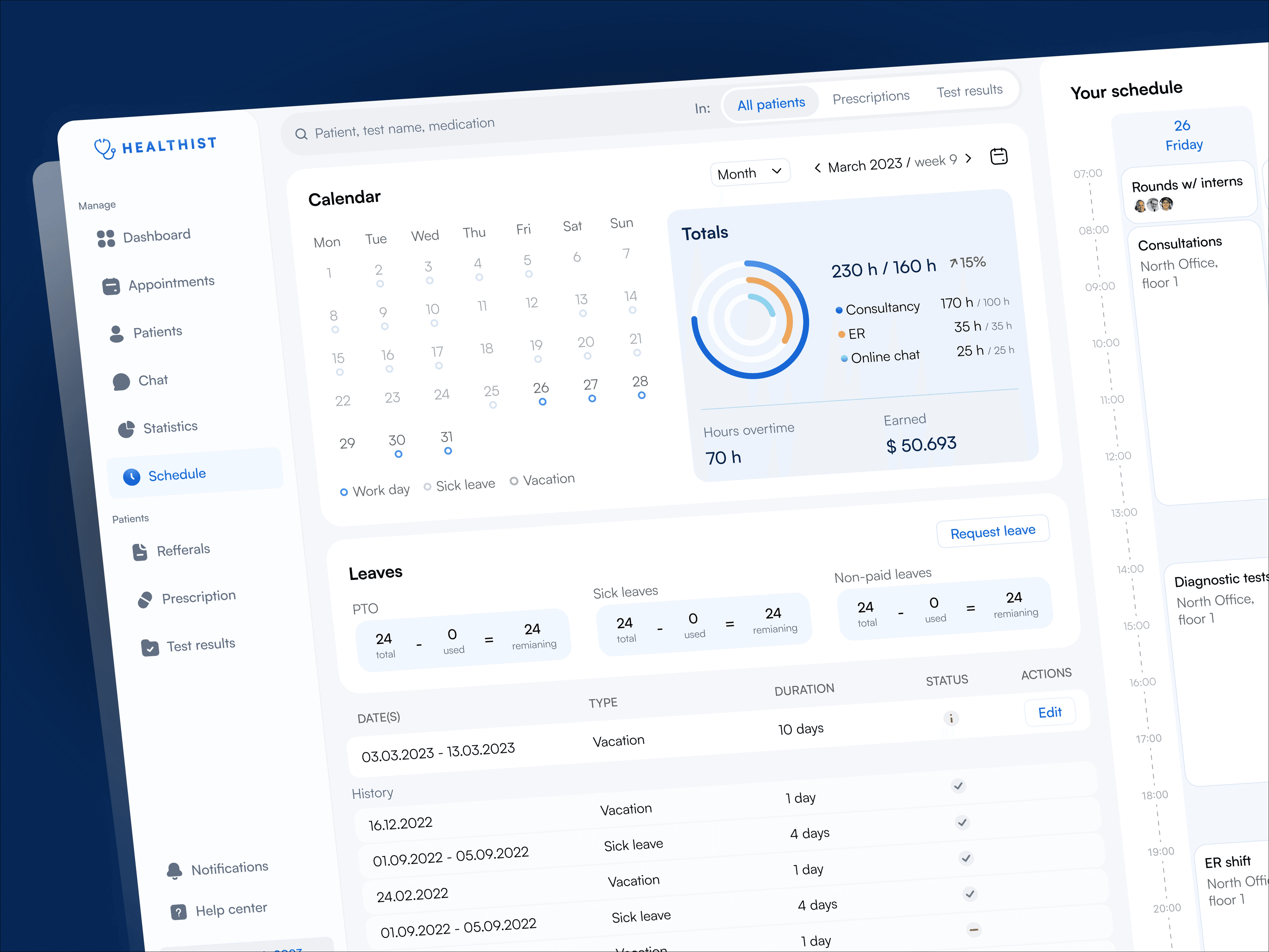
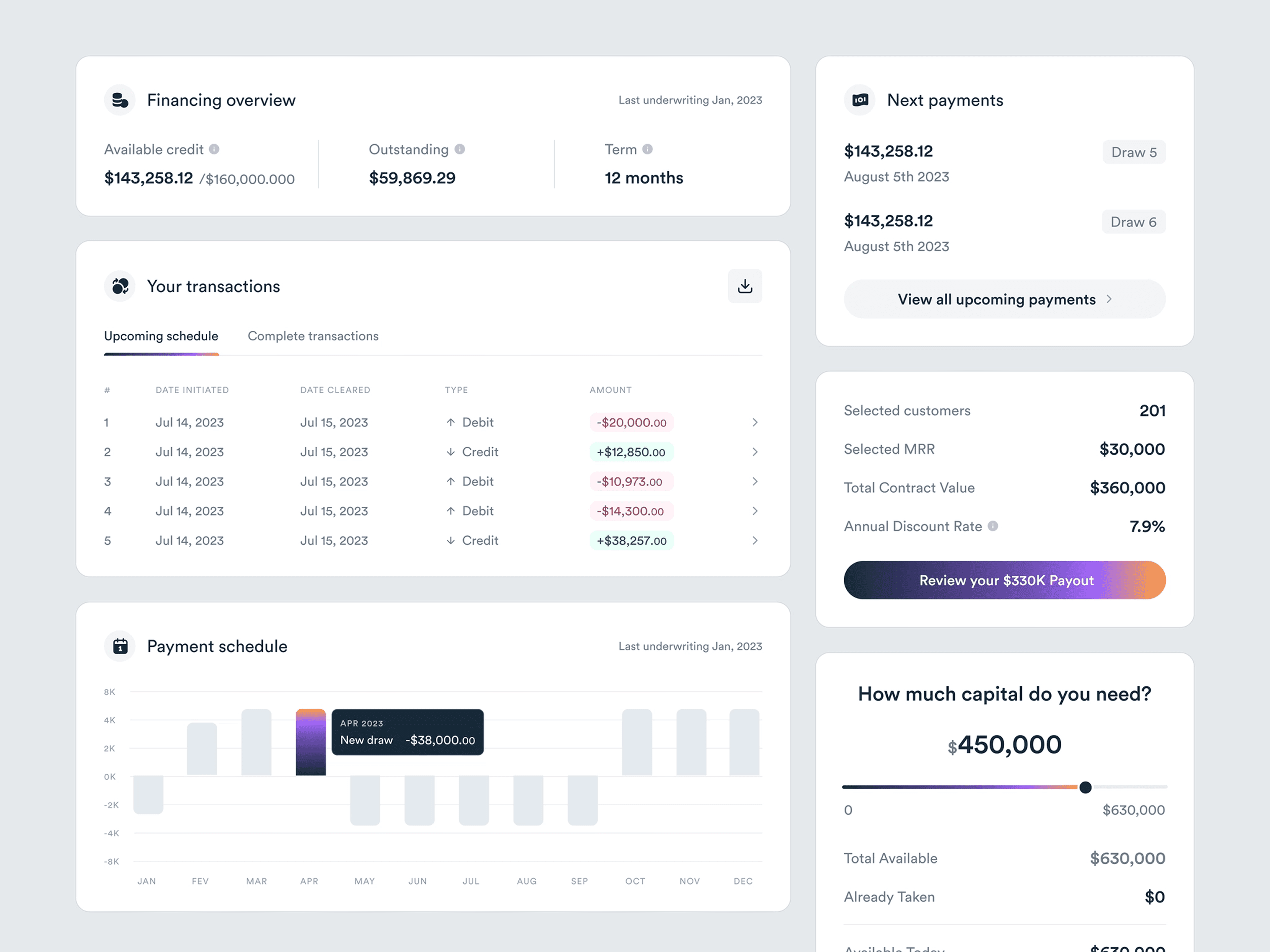
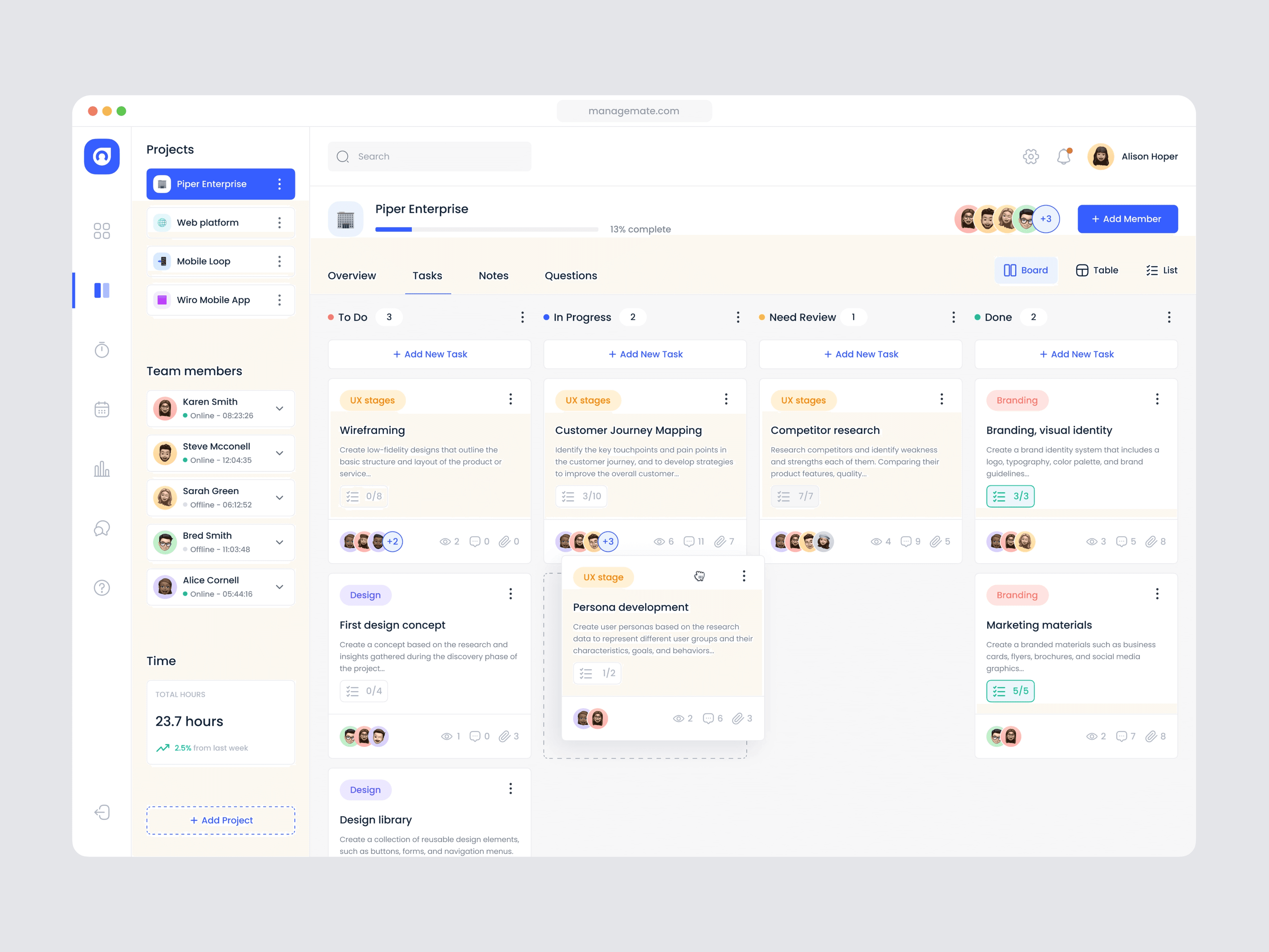
Image sources: Healthist - Hospotal management app, Dribbble Dashboards by Vlad Szirka, Dribbble Investment dashboard by Mike, Dribbble
Image sources: Healthist - Hospotal management app, Dribbble Dashboards by Vlad Szirka, Dribbble Investment dashboard by Mike, Dribbble
That foundation carried through all core areas of the product, including scheduling, project tracking, and CRM overviews. By relying on shared patterns and reusable components instead of one-off solutions, the interface remains cohesive as the product evolves. This approach supports complex workflows while maintaining a dependable, professional experience for enterprise field service teams.
That foundation carried through all core areas of the product, including scheduling, project tracking, and CRM overviews. By relying on shared patterns and reusable components instead of one-off solutions, the interface remains cohesive as the product evolves. This approach supports complex workflows while maintaining a dependable, professional experience for enterprise field service teams.
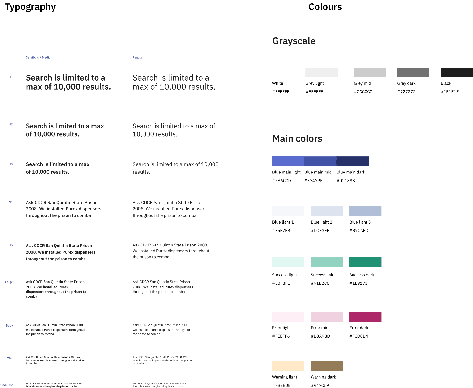
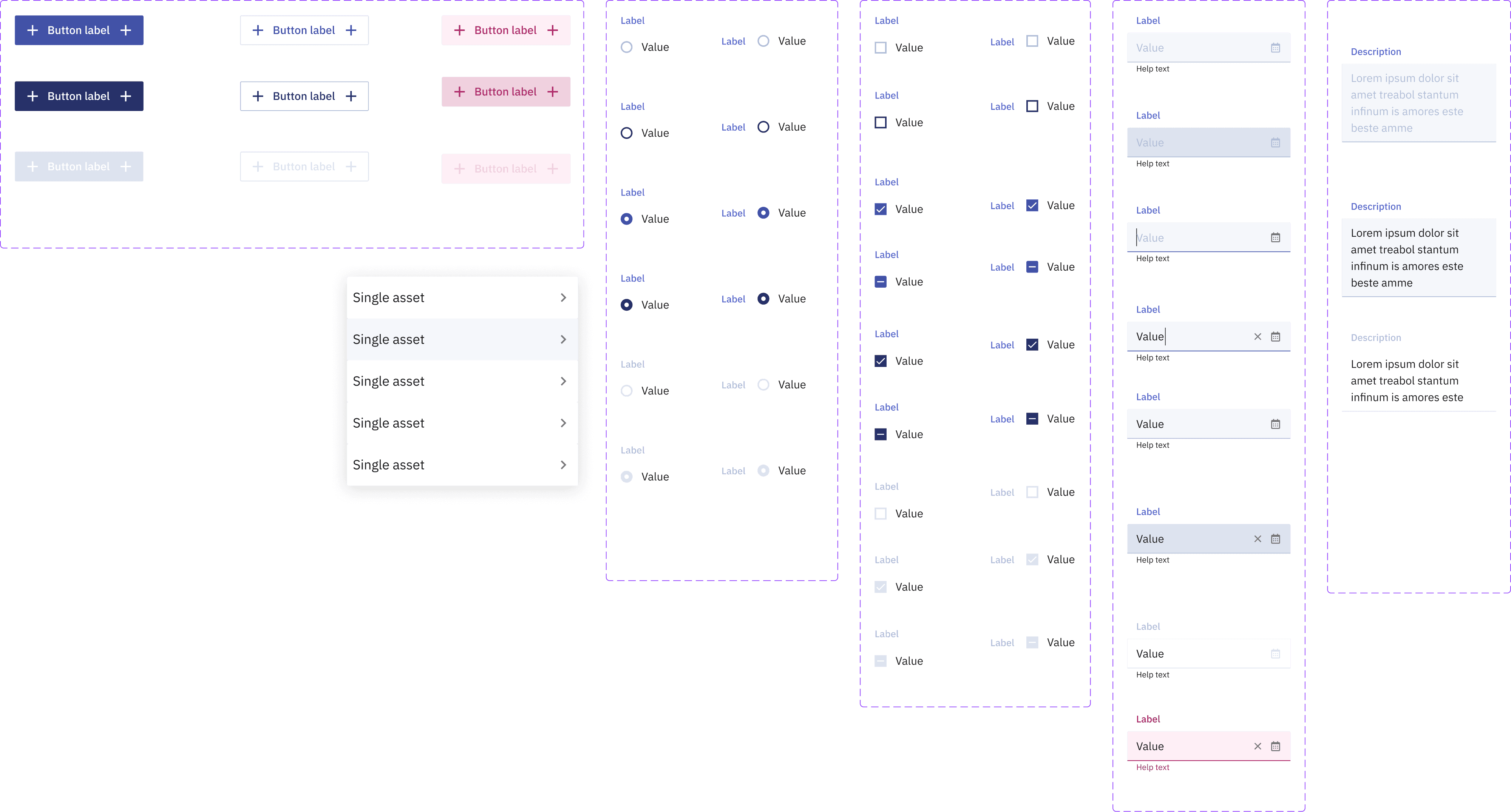
Styleguide
The UI had been built piece-by-piece by developers, which led to inconsistent components and unpredictable interactions. We reviewed the existing patterns and decided to rebuild the design system from scratch - we defined new components, interaction rules, and a clear visual hierarchy, but only some of them are shown below.
The UI had been built piece-by-piece by developers, which led to inconsistent components and unpredictable interactions. We reviewed the existing patterns and decided to rebuild the design system from scratch - we defined new components, interaction rules, and a clear visual hierarchy, but only some of them are shown below.
Have you seen other case studies?

Capricorn Digital

Made with care - always happy to chat.


©2026
Jana Skobic